FAQ templates help businesses answer common customer questions quickly while improving user experience and SEO performance. A well-structured FAQ page reduces support tickets, builds trust, and guides users toward faster decisions. In this guide, you’ll learn how to create powerful FAQ templates, where to place them, and how top brands use them to improve engagement and conversions.
Studies consistently show that most users now prefer to help themselves before reaching out to support, and a clear FAQ page is one of the easiest ways to deliver that experience while quietly boosting conversions and SEO at the same time.
Let’s unpack what FAQ templates are, why they matter, where to use them, and how the best brands structure theirs – and then turn those lessons into best practices you can apply to your own site.
What Is an FAQ Template (and Why It Matters)?
An FAQ (Frequently Asked Questions) template is a reusable layout or structure designed to present common customer questions and their answers in a clear, organized way. It can live as a standalone page, a section on a product page, or even as a collapsible block in your help center.
The main goals of a strong FAQ template are to:
Answer the most common questions quickly and clearly
Reduce the need for direct support tickets or calls
Improve user experience by removing friction from the buying journey
Most FAQ sections are grouped into themes like:
Orders, shipping, and returns
Product details and usage
Technical issues and troubleshooting
When done right, your FAQ page becomes a 24/7 digital support agent that never gets tired and never loses its patience.
Types of FAQ Templates You Can Use
Not every FAQ has to look like a long list of questions on a single page. Different formats work better for different use cases and audiences. Here are some popular approaches:
General Q&A layout – A classic list of common questions with answers, usually grouped into categories.
Product-specific FAQ – Focused on one product or service, typically placed on that product’s page.
Troubleshooting FAQ – Step‑by‑step solutions for common technical problems, often in software or tech products.
Customer service FAQ – Covers orders, billing, refunds, and policies to offload repetitive support queries.
Policy and compliance FAQ – Explains legal or policy topics (privacy, data usage, terms) in simpler language.
Pre‑purchase FAQ – Targets objections and concerns before a customer buys, helping increase conversions.
Single FAQ page – A central hub that links out to more detailed help content or guides.
Homepage or footer FAQ – Short blocks answering top-level questions for new visitors.
Blog post FAQ – A section at the end of an article addressing common follow-up questions.
Video FAQ – Short clips answering key questions visually, often embedded on help or product pages.
AI‑powered FAQ – Dynamic, searchable FAQs with chat-style experiences pulling from a knowledge base.
You don’t have to choose just one. Most mature websites mix several formats across their user journey.
How FAQ Templates Improve Customer Service
A good FAQ page is one of the most underrated customer service tools you’ll ever build. When you structure it properly, it quietly does the following heavy lifting:
Always-on support: Customers across time zones can find answers at any hour without waiting for replies.
Consistent information: An FAQ becomes a single source of truth, so your messaging stays consistent.
Faster resolutions: Users solve simple issues themselves, freeing your support team to handle complex cases.
Happier customers: People love solving their own problems quickly, without having to explain things multiple times.
It also has a nice internal benefit: your support team can link to FAQ entries instead of typing the same explanation over and over.
Key Elements Every FAQ Page Should Include
Throwing random questions and answers onto a page isn’t enough. A high-performing FAQ template usually includes:
Clear, focused questions
Use the exact phrasing your customers use (from emails, chats, or search queries) so answers feel instantly relevant.Concise, helpful answers
Get to the point, then add optional detail or links for those who want more depth.Logical categories
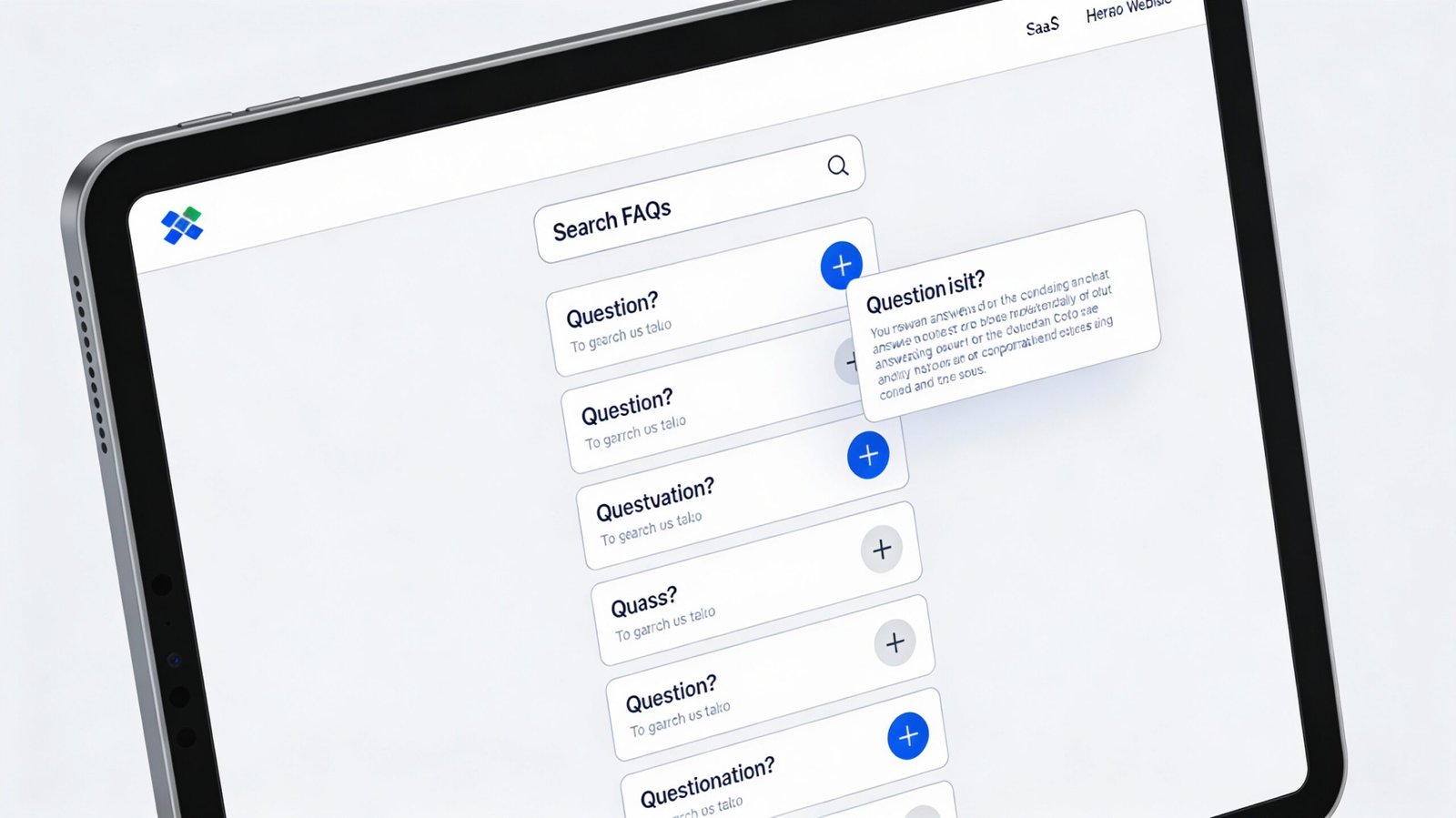
Group questions into sections (e.g., “Shipping & Delivery,” “Billing,” “Account & Login”) to make scanning easy.Search functionality
A search bar on larger FAQ hubs helps users jump straight to what they need.Links to extra resources
If a topic is complex, link to a full guide, policy page, or tutorial rather than cramming everything into one answer.Clear contact options
Some users will still need human help. Make “Contact us” or “Still need help?” options easy to spot.
Think of your FAQ as a decision-support tool: it should help people get unstuck in as few clicks as possible.
Where to Publish and Surface Your FAQs
An FAQ that’s buried three layers deep in your menu is essentially invisible. To make it genuinely useful, place it where people naturally have questions:
Main navigation
Add “Help” or “FAQ” in your top menu or footer so users can reach it from any page.Product or service pages
Include mini FAQ sections answering questions specific to that product—sizing, compatibility, materials, guarantees, etc.Checkout pages
Address concerns about shipping time, payment methods, returns, or discounts right where purchase anxiety peaks.Customer account portal
Include FAQs about login, billing, order history, subscriptions, and profile changes inside your dashboard.Social media bios and posts
Link your FAQ from profiles or pin posts for common queries (returns, shipping, pricing).Email signatures and campaigns
Add a “Frequently asked questions” link to support emails, onboarding flows, and transactional messages.
The easier it is to find your FAQ, the fewer “quick question” emails your team will have to field.

18 Inspiring FAQ Templates from Real Brands
You can learn a lot by looking at how well-known companies structure their FAQ pages and help hubs. Here’s a quick tour of 18 examples and what they do especially well (you can search each brand’s FAQ by name to see the full layout):
AdEspresso
Uses a clean, distraction-free layout with a small set of focused questions, each linking to deeper blog posts or guides for more detail. Users can either get a quick answer or dive deeper with one click.
Adobe Creative Cloud
Combines a powerful search bar at the top with sidebar categories, enabling users to filter by topics like accounts or products and get to answers quickly, even in a large knowledge base.
Airbnb
Splits FAQs into two main paths—one for hosts and one for guests—so each audience sees only what’s relevant. Uses visuals and even videos to clarify complex topics like policies and listings.
Airtable
Integrates FAQs into a broader help center, with categorized questions, searchable content, and tutorials that turn basic answers into step-by-step learning resources.
Ancestry
Personalizes FAQ content based on the user’s account and results, making help feel highly relevant to each person’s unique genealogical journey.
DoggieLawn
Pairs simple, accordion-style FAQs with live chat availability so users can escalate easily if they don’t find what they need. The layout stays clean and approachable.
Etsy
Divides FAQ Templates for buyers and sellers and backs them with a strong search function plus direct “Get help with an order” actions to handle time-sensitive issues.
Fabletics
Organizes FAQ Templates by categories like orders, returns, and membership, and offers related question lists so users can explore a topic without jumping between multiple pages.
Liquid Death
Matches its bold, playful brand voice in the FAQ while still delivering clear, practical answers through accordion sections and strong visual hierarchy.
Mailchimp
Uses clearly labeled sections and supplements answers with tutorials and how‑to guides, ending each topic with visible options to contact support if needed.
McDonald’s
Offers filters by topic (nutrition, locations, franchising, etc.), so users can drill down to specific interest areas quickly instead of scrolling endlessly.
Microsoft
Hosts a large, structured FAQ with expandable sections to keep pages uncluttered, and prominent links to contact support when issues get more technical or complex.
Nintendo
Uses a classic Q&A layout enhanced with “jump-to” lists and product- or game-specific groupings, helping users find hardware or game support quickly.
Upwork
Combines a strong search bar with segmented content for freelancers vs clients, plus related topics and links to community forums and direct support.
Vrbo
Splits FAQ Templates for travellers and property owners, then breaks each group down into clear categories like bookings, payments, and property management, often with expandable answers and helpful visuals.
Wandering Bear
Injects humor into its FAQ Templates while still keeping answers detailed and logically structured, making support feel on-brand and enjoyable while still useful.
Offers a compact, search-focused FAQ Templates with a table of contents, popular topics, and category filters for features, security, and device-specific questions.
Wistia
Uses a floating footer with a search bar and support ticket option, so users can ask for help from anywhere in the help center without losing their place.
Across these examples, a few patterns stand out: focused content, strong search, smart segmentation by user type, and easy escalation to human support.
5 Best Practices for Creating a High-Performing FAQ Page
Ready to build or overhaul your own FAQ section? Here are core practices to follow:
Let real data dictate your questions
Don’t guess what to include. Pull questions from:
- Support tickets and chat transcripts
- Website search terms
- Google Search Console queries
- Sales call and demo note
This ensure you answer the question people actually ask, not what you think they should ask.
Keep questions and answers simple
Avoid jargon, legalese, and long-winded paragraphs. State the question clearly and answer it in plain language, then link to a deeper resource if necessary.
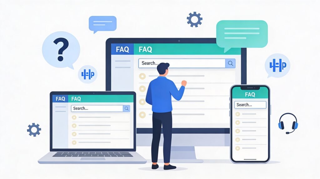
Design for mobile from day one
Many users will visit your FAQ Templates from their phone. Use collapsible sections, large tap targets, and readable font sizes so the page is easy to skim on small screens.
Always offer a way to contact you
Even the best FAQ Templates won’t cover every scenario. Include visible options like live chat, email, phone, or a ticket form with a clear label such as “Still need help?”.
Review and refine regularly
Track which questions get the most views, which searches return no results, and where users still contact support after visiting the FAQ. Update and expand content accordingly so it stays accurate and relevant over time.
Treat your FAQ as a living document, not a one-time project.
Common FAQ Page Mistakes to Avoid
Just as there are best practices, there are also traps that can quietly wreck the effectiveness of your FAQ:
- Overloading with information
Long blocks of text or trying to answer 20 questions in one response can overwhelm users. Keep things tight and link out for depth. - Poor organization
A big unstructured list causes people to bounce. Categories, headings, and search make navigation feel effortless. - Outdated or inconsistent answers
Policies, pricing, or features change. If your FAQ lags behind reality, you’ll confuse customers and frustrate your support team.
If you hear “your site say something different” too often, it’s a sign your FAQ and other page are out of sync.
Conclusion
A great FAQ page does far more than answer a few random questions. Built thoughtfully, it become a key part of your customer journey: reducing friction, boosting trust, and cutting down repetitive support work. By using clear template, organizing content intelligently, learning from leading brand, and treating your FAQ as a dynamic asset, you transform it from a forgotten link in the footer into a genuine growth and service tool.
Whether you’re just starting out or optimizing a mature site, investing time into a smart FAQ structure is one of those rare wins that benefits your customers, your team, and your bottom line all at once.